THE DESIGN BEHIND JAHIA’S NEW LOGOS
In keeping with the pace of our industry, it became evident that our logo needed to match our place in the market as a sophisticated leader in digital enterprise transformation. Accordingly, our in-house team of graphic designers - with expertise from corporate identity to user experience to product design - put our ideas together. In particular, Fernando Marin Canet contributed the core concept that eventually became the new logo. We shared the results of our collaborative efforts with the general staff to get everyone’s input and voila! The new Jahia logo was born.

The result is that our new logo honors our Jahia heritage in terms of being industrialized, modern (even futuristic) and simple. It is distinctive in our industry. The rounded edges give it a human feel, which we wanted as a way to communicate that people really are the center of our business.
The blue ‘dot’ reflects our past as well as the solution - the missing piece that will make everything work.
AND, if you look closely, has a pointed edge. This small detail is significant in that it shows an element of the ‘X factor’, present in all our new product logos as well, as part of the digital ‘eXperience’ management platform we provide to our customers.
We also decided it was time to rename our signature product from Digital Factory to Digital Experience Manager, or DX7 for short. The blue dot carries through the new product logo for DX7 for a complete experience of our brand, as you can see here.

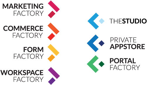
The concept of all our product logos is based around the X element to reinforce that Jahia is a leading provider of a customizable digital experience management platform.
The arrows for the products most appropriate for marketers points to the right, while the arrows for the products most relevant to developers point left. At the same time, the colors for the marketers’ products are warm and friendly, while the cooler colors assigned to the developers’ products shows clarity and intelligence. There is contrast and yet, together, they represent the full range of experience through the color spectrum.

When you put the arrows of each side together, they form an X. In other words, each perspective, or role, of these products contributes to the whole experience. And experience is the center focal point of our branding.
To re-brand a company and product suite visually is quite an undertaking, and this process will take months to complete. You may see discrepancies here and there in our marketing going forward; please know that it is a work in progress. But now you know the experience behind the experience.
Why did it matter for us to make these changes now? Because we believe that good design is good business.